| home | profile | current/ recent projects | news | research/consultancy | writings | past projects | clients | voluntary | contact |
|
Nicky Hirst, Unto the Sea, commissioned by London and Quadrant Housing Trust for the River Walkway, New Union Wharf, Isle of Dogs, East London 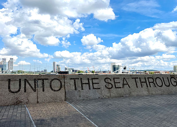 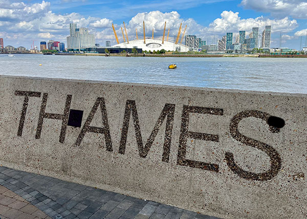 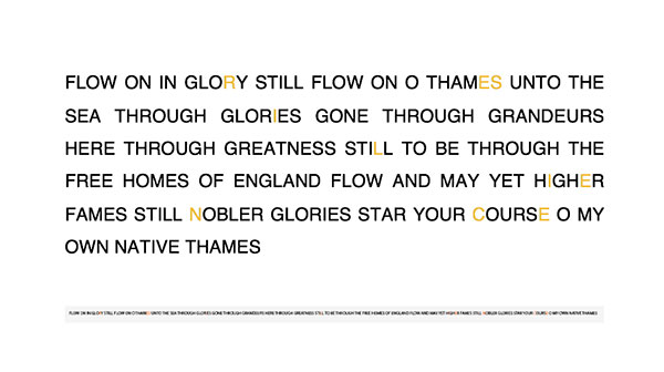 Nicky Hirst ‘Unto the Sea’ detail, commissioned by London and Quadrant Housing Trust, for New Union Wharf, Isle of Dogs, London, 2022 Nicky Hirst, ‘Unto the Sea’ detail, commissioned by London and Quadrant Housing Trust, for New Union Wharf, Isle of Dogs, London, 2022 Nicky Hirst, ‘Unto the Sea’, full text, sandblasted onto 170 metres of the river walk wall
Notes on the artwork by the artist Nicky Hirst Proposal The words RESILIENT (referring to the people) and CALM (referring to the environment) have repeatedly been referred to in my research, therefore the artwork reflects both qualities. My selected text is the last stanza of a poem by William Cox Bennett (1820 - 1895), an English poet who was born and lived in Greenwich. The poem, ‘The Glories of Our Thames’ was written and published whilst a historical boat yard was operating from Folly Wall. The Thames that the poet refers to is the exact Thames that previous residents of the New Union Wharf site were living and working on. ‘Flow on in glory, still flow on, O Thames, unto the sea, Through glories gone, through grandeurs here, through greatness still to be: Through the free homes of England flow, and may yet higher fames, Still nobler glories, star your course, O my own native Thames!’ Site Isle of Dogs is unique among London districts for its watery boundary. Like the flow of the tides coming and going, people walk and run in both directions up and down the side of the wall. We read from left to right, but the artwork has to ‘journey’ and work in both directions. I have referenced this duality by selecting a text with rhythm and repetition. The Helvetica font is similar in style to the simple font used on the original boat yard building as seen in the photograph from 1893. The word RESILIENCE will be picked out in lichen-coloured yellow letters through the work. Intention This artwork is a celebration of place. The wall maintains its strength and integrity whilst the text speaks of an open outlook and fluidity, with an affirming nod to glories past and greatness still to come. I have chosen to use capital letters for two reasons. I think the classic blocky Helvetica font lends itself to the architecture and handsome solidity of the site. Nearly half of the upper-case letters here are symmetrical, which adds to the legibility in both directions. Nicky Hirst |